Published: 14-10-2016
Updated: 30-05-2021
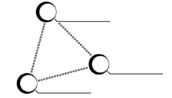
This is my logo. It was thought up by me and my brother made it with his creative help and expertise.
The three circles are the main part of the logo. Their locations each represent a point of reference. Opposed to the common perception of a dualistic world of opposites they depict the world is at least a little bit more complicated than just side A or B, or somewhere in between. There are many more possible positions to find in the layout of these three points. There’s good and evil in the world, but also a force that observes them both; the all seeing eye of truth.
At each of these locations there is a circle with a thickened wall on one side, which in this logo resemble emotions. They are laid out in a perfect triangle which represents logic. The horizontal lines that originate near the edge of each circle are designation lines. The kind you would find on a picture in a biology textbook which mark and identify certain structures, for example. These lines represent analysis. They analyse both the position and the emotion.
In this work, I don’t mean to judge, but rather I wish to look at each position and paired emotion as valid and something to be analysed. Of course I have my own biases, but I wish to understand each position rather than to just dismiss them, just as I want others to understand me rather than to dismiss me.
~reckneya